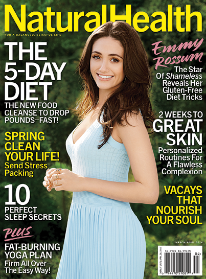
THE PATIENT:
Natural Health
AGE: 42 years
VITALS: Improving
PROGNOSIS: Excellent
BY CABLE NEUHAUS

Most of the patients we see are sickly. Normally, by the time a magazine comes before the Medic, it is showing signs of advanced deterioration. Naturally, it grieves us to observe such decay, knowing too well that even a cocktail of high-dose meds may fail to restore vitality.
Especially for magazines that have been around the block a few times, experience suggests that the much prized legacy that was once The Asset has too often devolved into The Liability, leading inexorably to a fate worse than death: irrelevance.
And so here we have Natural Health, our current patient, which began life in the hazy afterglow of the hippie era as something called East West Journal. At its start, it was an ill-defined meditation on everything from flying saucers to cancer-killing foods. Over the decades, it survived its owners’ muddled intentions, and eventually it morphed into Natural Health, a brand pitched totally to women.
Last year, management brought in a new editor, Laura Kalehoff, from Meredith’s American Baby. She immediately proceeded to sign up what she calls her “dream team” staff. “We weren’t in a make-over-this-magazine situation,” Kalehoff told us. Nevertheless, smartly, she ordered up more than a mere dermabrasion. The entire book has been reanimated and brightened. And that fresh group of editors she recruited? Every Monday they take turns hosting an in-office “Lunch Bunch” that features homemade meals—an effort to walk the health talk.
So, it seems this book may at last have an opportunity to be differentiated from its long (but, alas, undistinguished) history and, too, the mediocrity that has defined many of the magazines operated by its present owner, American Media, Inc.
What We Prescribe
• In this category you simply cannot have a more perfect name than Natural Health. And yet the new cover template, which includes a revised logo, is so fem-generic as to be all but invisible. We challenge you to quickly locate this magazine on a big newsstand. What’s needed is a far more distinctive cover design.
• If we’re gonna be a Nag Medic, which is our obligation, then we have got to say that this trend of putting your cover story way, way up front, ahead of everything else in the book, is bold but maybe not so wise. Please reconsider.
• Natural Health uses what must be the largest folios—like 48 points!—in the biz. Beautiful typography, granted, and nicely integrated into the new grid. But c’mon, this is an absurdly disproportionate visual element that misdirects the eye.
• Kalehoff boasts that celebrities are beginning to approach the revivified magazine, requesting covers. Three words on that: Proceed with caution.
Medic’s Note
Natural Health has been blessed with the ideal title in its competitive set, plus a new editor who’s trying to inject some energy into the tired ol’ gal. This time, AMI, bet against bland. ![]()