Title:
Louisville Magazine
Issue: January 2015
Frequency: Monthly
Circ: 24,000
Editor: Josh Moss
Art Director: Suki Anderson
Publishing Company: Louisville Magazine Inc.
Title:
Louisville Magazine
Issue: January 2015
Frequency: Monthly
Circ: 24,000
Editor: Josh Moss
Art Director: Suki Anderson
Publishing Company: Louisville Magazine Inc.
A brand has a lot more freedom to be creative when newsstand distribution accounts for roughly 5 percent of total sales. That is certainly the case for Louisville, and there is no better example than its January cover.
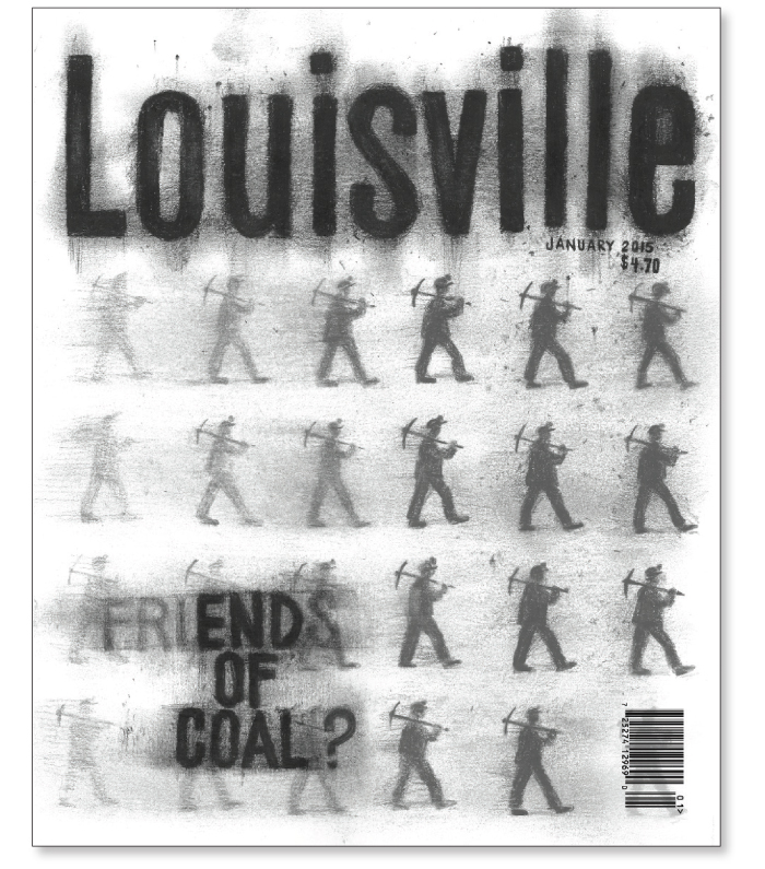
Louisville art director Suki Anderson says that once the team decided to use coal as the main feature, the challenge was developing a captivating cover image. The first concept used an image of a lump of coal, but Anderson quips that not only did it not work, but it “looked more like a lump of poo.” But she says that once she got to read the feature, it became clear that it’s more about the people and the community than the industry and product. So her new objective was to show the people and the impact of job losses.
Before contracting artist Douglas Miller to create the charcoal drawing, Anderson mocked it up on a chalkboard and used an eraser to create a faded effect. She wanted the cover to implicitly depict a graduation from darkness to light. That also factored into the gradient coverline, which reads two ways—“Friends of Coal?” and “End of Coal?” The coverline is a play on a popular bumper sticker seen around Kentucky. “It means something in that greater way and is something people would recognize,” Anderson says. “It’s making a statement versus saying we are going to explore this.”
With Louisville’s limited newsstand dependence, Anderson had the advantage of going all the way with this cover, even making its signature logo part of the design. This can be risky for most magazines, but it’s something Louisville doesn’t shy away from. “We feel that the people who know the magazine will recognize who we are,” she says. ![]()
DESIGNER’S COMMENTS
I really like this cover. It appeals to my design sensibility, communicating a magazine’s cover story by acting as a mini poster or graphic in a striking, immediate way.
It instantly says coal. The charcoal illustration is well done, too. It’s never as easy as you’d think to find a style that hits the mark. Also, although monochrome, I imagine this would stand out considerably among other magazines, whether on a shelf, table or newsstand.
Typographically, it’s clever and clear; it doesn’t force-feed you the story inside. Does it need a byline in their house font to give it an editorial link? Possibly. Personally, I’d like to see some element of brand identity there, even if it’s small. But this is certainly not a deterrent in whether I’d pick it up or not.
It can also be a thorny subject when you manipulate your cover logo to match the main graphic, but they have kept the Louisville hed in its sans serif style, so the brand is still familiar to regular readers. A magazine like Louisville, with its target market, should have the creative freedom to experiment with its covers. I hope it continues to keep its level of quality and invention.
Chris Deacon/Art Director/Time Out New York
I am constantly amazed at how great, smaller run magazines have become—and I am a big fan of so-called ‘city magazines.’
In short, I really dig it (no pun intended). This cover really shows what a good and well thought out design can do, and do so without being expensive or over-the-top. It’s smart and provocative and I love the hand-drawn nature of the whole thing. It really makes me want to understand why the ‘friends’ portion of the word has been erased. I also like the fact that it covers a singular topic, when many other publications have so many cover lines that they are distracting. If there were only one problem, I suspect that the circulation department had a cow with the tone behind the barcode. But considering every designer hates that thing, I think it most likely was fine. This was an inspired piece if ever there was one.
Michael Mrak/Design Director/Scientific American
Have a unique “cover” story? Contact Senior Editor Caysey Welton at cwelton@accessintel.com.