From varied locales to the ideals of its people, the world is abundant with contrast. But those differences, those unexpected combinations are what make it such a unique and interesting place.
For home décor, Pantone Color Institute Executive Director Leatrice Eiseman said this idea translates to unusual color combinations that reflect consumers’ individual tastes.
“There is this groundswell consumer reaction that is saying ‘I want to do it my own way, and if that’s not part of the rulebook that’s OK,’” she said. “You saw a color in a window or on a website and you said, ‘Wow, I never would have dreamed of putting those colors together,’ and yet the response is not negative. You’re looking at it and saying, ‘Wow, that is really interesting. Why didn’t I ever think of doing that before?’”
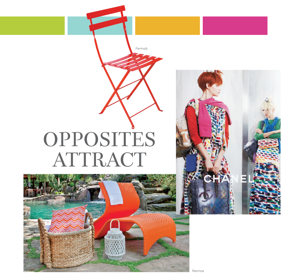
Pantone’s Serendipity palette embraces the unusual, featuring an assortment of vibrant hues that run the gamut from warm to cool. Bold Puffin’s Bill orange, Scarlet Sage and Magenta give way to cool Spring Crocus purple, Eggshell Blue and Tiger’s Eye taupe before circling back to warm shades of Bright Chartreuse and Golden Glow yellow.
“It’s such a wonderful combination of old and new,” Eiseman said. “Serendipity is a pleasant surprise or a happy accident. It’s the coming together of unlikely designs and unexpected colors that you really look at and say, ‘Wow, I just wouldn’t have thought of that.’ We’re trying to encourage people to just let go of some of those hard and fast rules.”
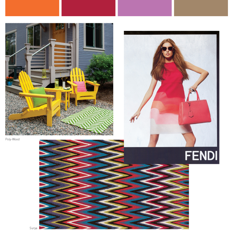
Clean Slate, a palette from The Color Association’s 2014-15 forecast, similarly uses extremes to create something fresh and original. The palette incorporates what Leslie Harrington, executive director of The Color Association, calls “awkward pairings,” like cool gray Nitty Gritty with neon pink Hell Ya, warm gray Beam Me Up with orange-gold Catalyst, and pale pink Imaginary Friend with rich red Sherri Baby.
“We’re living in a weird world right now with all the fluctuations in temperature, going from one extreme to the other,” Harrington said. “It seems like all of that is starting to weigh heavily on everyone, so we’re looking for a way to start clean, kind of a blank canvas. We’re exploring a lot of mixing of lights and darks, combinations of whites and grays and neons. So it has this really kind of weird blend of super neutral with super color. I really like this idea of almost two ends of the spectrum so juxtaposed with each other.”
One of WGSN-Homebuildlife’s trends for 2015, History 2.0, melds “real histories with imagined futures” to create unique designs with a fantastical edge in which Cherry Red and Petal Pink merge with Black, Cocoa, Granite and Parchment.
“Designers explore both new technologies and ancient craft techniques,” said Greg Dunlop, global commercial director for WGSN-Homebuildlife. “In this way, they breathe fresh life into retro design styles. We look to stories that connect past and future as our imaginations expand into ancient history and futurist scenarios.”