Switching Your Email Products to a Mobile Format
The must-do tactics for making some of your most important products mobile-friendly. By Bill Mickey

While publishers rush to optimize their digital products for mobile, the focus is often on the website. But e-newsletters, especially in b-to-b, are a crucial product platform that often gets overlooked. As mobile drives anywhere from 30 to 50 percent of traffic these days—on the high end—and newsletters are a key direct traffic referral source, making sure email products are properly optimized and formatted for mobile needs to be a strategic priority.
“Ignoring mobile is not really an option these days,” says Eli Dickinson, cofounder and CTO of Industry Dive, a b-to-b mobile media company targeting multiple verticals. “It’s not that the market is moving towards mobile, it’s already there.”
Dickinson says that many of his newsletter opens, depending on the time of r than 50 percent mobile. That’s a metric that simply can’t be ignored. But there are specific tactical steps publishers need to take before jumping onto the mobile screen.
The Use Case
How your readers use mobile is very different than how they engage with content on the desktop or even in print. If your newsletter traditionally has a list of headlines with descriptive abstracts you should consider minimizing this format. “If you have a newsletter with lots of long content, the use case is different,” says Dickinson. “People expect to quickly get to what you want to tell them. They may not scroll through a big header and lots of boilerplate.”
But be careful, going too minimalist can turn your mobile-optimized newsletter into a dull read. At ALM, which has put mobile at the core of its digital strategy, an initial newsletter redesign only included headlines. When readers criticized the change, a second design included headlines only above the fold and abstracts were added back in below the fold. “When you roll out a new product, you may not get it right on the first go-round. Keep your ear to the ground and listen to your customers,” says Lenny Izzo, ALM’s SVP and chief marketing officer.
Even so, with the streamlined content approach, headline writing changed yet again, notes Izzo. “This meant our headline writing had to be much more revealing,” he says. “We had to learn how to write mobile-specific headlines. This did not immediately come naturally to our editorial group.”
Know What Devices Your Audience Uses
This may sound obvious, but canvass your audience to determine the range of devices used. “This should probably be your first step,” says Dickinson. “Some verticals might make sense to support Blackberry, others not so much.”
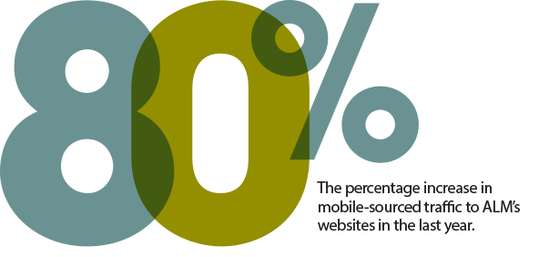
At ALM, which serves the legal market, among others, Izzo says they discovered that 9 out of 10 lawyers use smartphones and 1 in 3 use tablets. More broadly, the number of mobile-sourced visitors to ALM’s websites has jumped 80 percent in the last year, which, says Izzo, has far outpaced the growth from desktop and laptop users. “When you get this right, it’s a huge lift,” he says.
Don’t Ignore After Hours or Holidays
Paying attention to the time of day your readers access content from mobile devices is key, too. You’ll likely find that access is happening after typical work hours, on the weekends and even holidays. “If you send a newsletter outside of normal working hours or during lunch, mobile gets much higher opens,” says Dickinson. “Some of our record open rates have been during the holidays.” 