Title:
Vermont Life
Issue: Autumn 2013
Frequency: Quarterly
Launched: 1946
Circ: 45,000
Editor: Mary Hegarty Nowlan
Art Director: Susan McClellan
Publishing Company: State of Vermont
“My first impression of the Huffington cover was its immediacy, cleverness and its seamless production. A few minutes later, I developed second thoughts about its concept. Mixing an iconic metaphor (the hoodie—which itself has polarizing interpretations depending on one’s background) with a historic photo of one of the greatest civil-rights leaders of our time feels like an awkward mash-up and an easy way out of a tough design challenge. Implying Trayvon Martin is on the same level as or is similar to Martin Luther King Jr. is a stretch and one I suspect most readers will disagree with.”
“That said, the cover does succeed in grabbing the readers’ attention; its overall art direction and photo-illustration is tight and well executed.”
“It would have been prudent to remove the three rooflines considering the controversial cover. Having a roofline of “Live Forever” seems a bit insensitive when one considers that both men symbolized on the cover died young and violently.“
Mark Montgomery, Senior Art Director, IEEE Spectrum magazine
“I don’t know what the Huffington’s budget is but I would think they’d have the money to create a new image (photo or illustration). Instead they created a concept they could not photograph, since both subjects (Martin Luther King, Jr. and Trayvon Martin) are deceased. But it is a memorable cover. They’ve still created something new and unique to their brand.”
“I’m distracted by the slugs and I wish they weren’t there. Somehow “Meet the New J-Law,” “Live Forever” and especially “Make a Soufflé” don’t seem to work with the very powerful cover story slug “Still Not Free.” If they were going for max impact they should have left the other text off the cover, especially since it’s a digital magazine.”
Amy Wolff, Photo Editor, PDN
Have a unique “cover” story? Contact associate editor Casey Welton at cwelton@accessintel.com

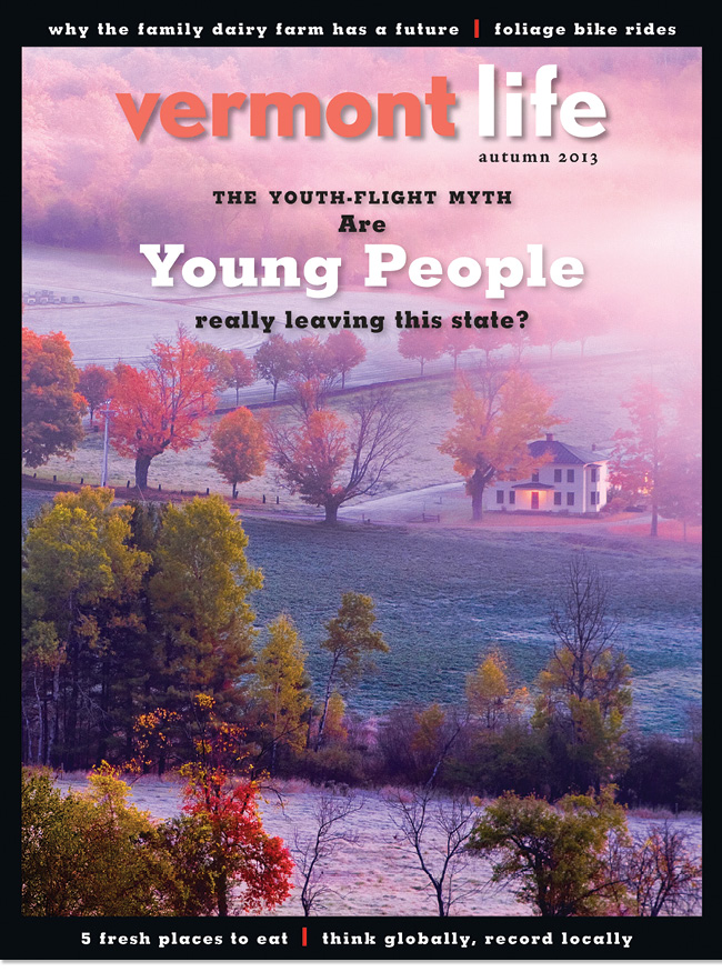
“This cover is a collection of several elements that are not in sync. The main cover line has nothing to do with the warm, scenic cover image and the black border traps the image and makes this issue look like a memorial tribute cover.
Since the logo is about the same size as the main coverline, I would have moved the coverline further away from logo and avoided using so many type sizes.
Alternatively, if their approach is to use the image more so as branding for a Vermont lifestyle, take all of the cover lines and run them discreetly on the bottom to allow the image to own the page.
A better choice of color for the logo could have also allowed the team to avoid using an old trick like the soft shadow.“
Josh Klenert, Vice President, Design & UX, The Huffington Post, Huffington magazine
“Let’s start with a bigger and bolder flag. Not necessarily a sweeping change of typography, but rather more careful use of kerning and set at a larger size. I’d also strongly recommend capitalizing the V and the L. Just by virtue of capitalizing those words the book would project more authority.
I like the dreamy autumn image and I understand why it was chosen. That said, given the sell line “Are Young People Leaving?” I think VL is missing an opportunity to craft a visual that’s a bit brasher, more youthfully exuberant. An energetic, present—hopefully iconic—image of a young adult would accomplish connectivity to the main draw, “Youth Flight.”
Finally, a glance backwards shows that VL covers have traditionally taken more of a coffee table book approach. However, these days it seems VL is tackling some rather heady subject matter. What I find at odds though, is the notion of placing these kinds of coverlines regarding modern day concerns on a visual conceit that harkens back to dreamy bygone days.”
Marshall McKinney, Art Director, Garden & Gun
Have a unique “cover” story? Contact associate editor Casey Welton at cwelton@accessintel.com
Nuance is a word you’d likely leave out of a conversation about Vermont’s fall foliage. However, that is exactly what should come to mind when looking at Vermont Life’s autumn issue.
The cover captures the bold, contrasting colors you’d expect to see in a Vermont autumn, but it’s an illuminated porch light cutting through morning fog that delivers a subtle, yet relevant subtext that connects the cover story to the image.
Photographer Gary Hall captures landscapes all over the state, and is a frequent contributor to Vermont Life. Art director Susan McClellan says she knew right away that Hall’s image was perfect for the issue.
“It fits both bills,” says McClellan. “It’s a beautiful, inviting and colorful image, and it works with the coverline about young people leaving the state—in that if you’re a parent you leave the light on hoping your kids will come home soon.”
Editor Mary Hegarty Nowlan agrees that the evocative image was a fitting complement to a bold cover story. “From an editorial point-of-view, we knew it was going to be a big story, a controversial story,” she says. “We didn’t want to make it depressing because the idea of leaving is not a popular thing to put on a cover. But this image really touched all of us.”
Nowlan and McClellan suggest that Vermont Life is becoming more contemporary and looking to speak to a younger audience. During the past six years there have been incremental changes made to the logo, typography and an addition of the black-box border. The magazine still aims to offer beautiful imagery, Nowlan says readers should expect more packages like this one. 