Title:
Smithsonian
Issue: january 2014
Frequency: monthly
Launched: August 1970
Circ: 2 million
editor: Michael Caruso
Art Director: Maria Keehan
Publishing Company: smithsonian Media

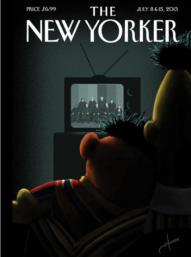
“The New Yorker’s ‘Moment of Joy’ cover proves that great ideas never die, they just bide their time in the vault until the right time. And by ‘the vault’ I’m talking about the mind of Françoise Mouly. Mouly gets several submissions from illustrators every week. So many that a few years ago she started a Tumblr blog ( blowncovers.com) showcasing the great ones she is unable to publish.‘Moment of Joy’ was one such ‘blown cover,’ originally submitted in 2012 by illustrator Jack Hunter in a slightly different form (Here, the Supreme Court replaces President Obama).Hunter’s dramatic lighting, painterly texture, limited color palette and surprising composition are both witty and beautiful. He has created a very ‘real’ moment between beloved, yet fictional, characters.The once nostalgic and forward-looking Sesame Street speaks to many generations.And Bert and Ernie have been part of our cultural family since 1969. The grey room and black and white TV are a subtle nod to this longevity even mirroring the actual relationship in the case before the Court.In The New Yorker tradition there are no cover lines, ensuring this is one of the few places, issue after issue, where pure editorial illustration commands your attention. The right illustrator, the right magazine, the right couple and finally, the right timing, made this one of the best covers of 2013.”
- Dave McKenna, Art Director, 5280 Magazine

DESIGNER’S COMMENTS
Smithsonian covers such a broad range of topics I’m always excited to see what visual direction the cover will take next—and once again, it doesn’t disappoint.
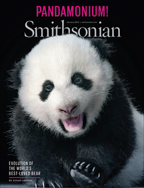
Featuring Tim Flach’s photo of Bao Bao is striking in its simplicity—the image animal fans in D.C. and beyond waited for. Keeping type to a minimum to let the adorable image carry the cover is the correct approach.
The use of magenta as an accent color adds a nice bit of pop. Overall a solid, fun and engaging cover.
Michael Goesele, Creative Director, Washingtonian
You just can’t go wrong with a cute baby panda on your cover. But you can make the cover even better with a punchy headline strategically placed above the headline.
The newsstand version is going to grab people’s attention with the cover line and will get the “aw” factor when picked up. Additionally, it is refreshing to see minimal additional lines on the cover, because it doesn’t need them. The cover already has a smart headline, descriptive copy, byline of an incredible writer and an adorable photo, with magenta as an accent color to top it all off.
Have a unique “cover” story? Contact associate editor Caysey Welton at cwelton@accessintel.com.
Panda’s have captivated people’s attention for decades and Smithsonian wanted to capitalize on that for its January issue with a photo album of the National Zoo’s endangered newborn cub, Boa Boa. However, as it turns out, the package turned into much more.
“We were working on a big issue called ‘101 Objects That Made America’ and at the time she [Boa Boa] was tiny and we had a picture of her mother as one of the influential objects,” says art director, Maria Keehan. “No one had access to her then, but we decided that as soon as we did, we should make it a big deal.”
Renowned animal photographer Tim Flach was brought in to shoot Boa Boa, but the sitting was not an easy one to pull off, according to Keehan. “Timing was a challenge, you have to consider time of day, feeding schedules. You have to be really careful about bringing in disease. It’s such a delicate process.”
Of course, there was more to it than that. “She was barely sitting up at the time. There were handlers and a lot of people in and around the zoo helping,” Keehan says. Given that, Flach and his team had to do some careful finishing work to remove background noise and the hands propping up the cub.
The hard work paid off. Keehan says the team got exactly the photo it wanted—one that implicitly suggests, despite her cuteness, that Boa Boa is still a bear.
Although Smithsonian only sells a limited number of copies through its museum’s newsstands, Pandamonium has newsstand flair. The image itself is hard to look away from, and is complimented by the primary use of black, disrupted by an enlarged magenta capitalized roofline, which Keehan says was very intentional.
“It needed one punchy and simple color,” she says. “It’s a process color, the magenta really seemed to meld well and standout.” ![]()